Landing Page Conversion Rate Increased by 42% with Two Minor Changes
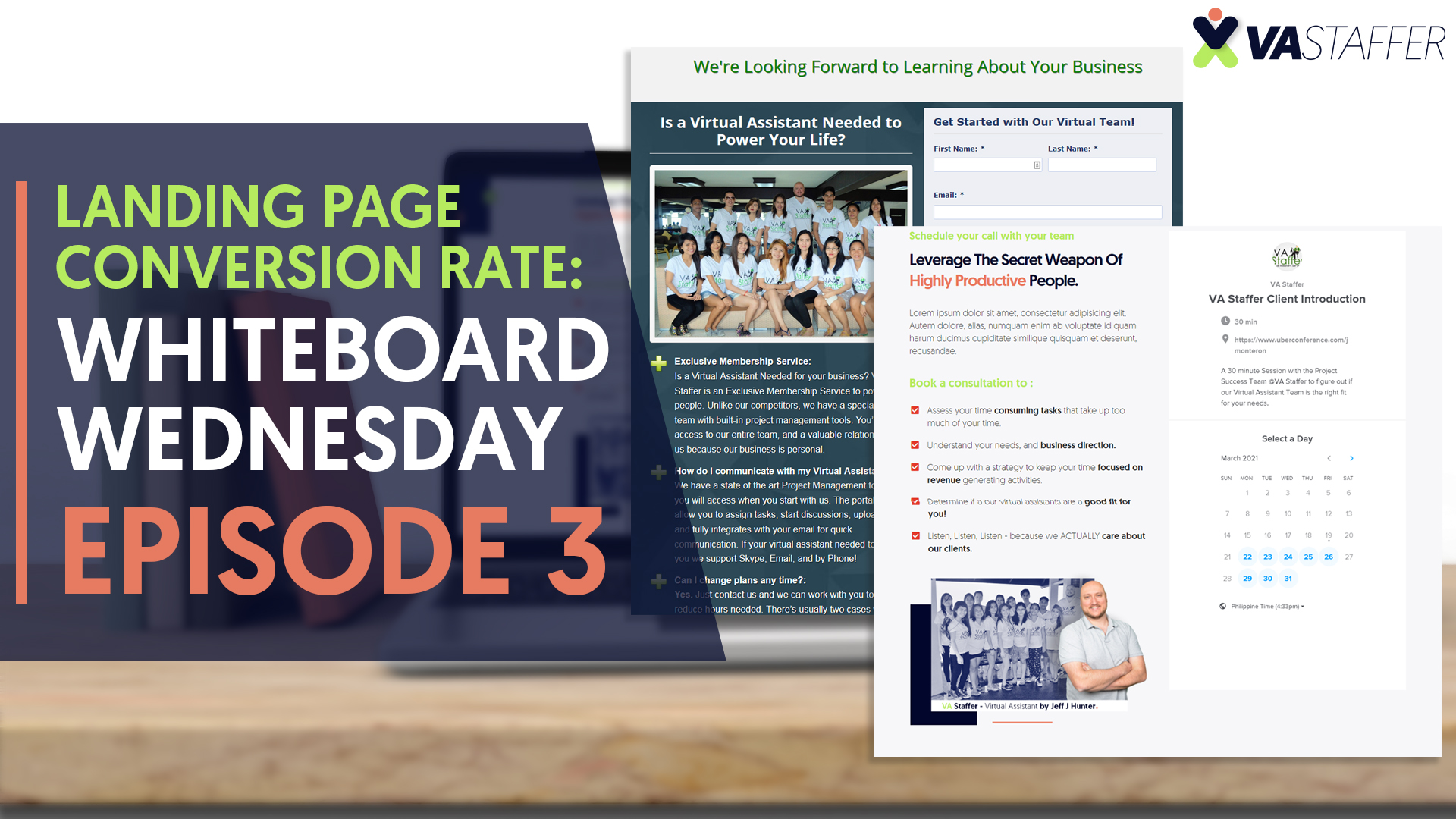
Welcome to Whiteboard Wednesday Episode 3 where I discuss how I had a landing page conversion rate increase of 42% by changing two elements on the page. This is just a simple example of how I was able to increase the conversion rate on one of my contact us landing page.
Landing Page Conversion Rate: What is it?
Conversion Rate is the percentage of people who go to a page on your website and they perform an action. This action could be completing a form, liking you on Facebook, or Twitter – or calling your office.
How did I Increase the Landing Page Conversion Rate?
FULL DISCLOSURE – I DIDN’T SAVE A COPY OF THE OLD LANDING PAGE WITH NO PICTURE (I know that they both do, but this research is based off of when I had NO picture)
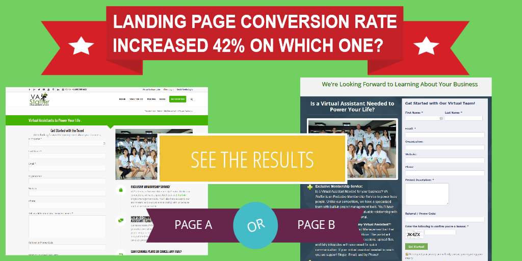
On the left is option A, it contains:
- It has a Logo
- A Menu
- Some Text
- Some bulleted Text (Checkboxes)
- The Form
- Privacy Statement
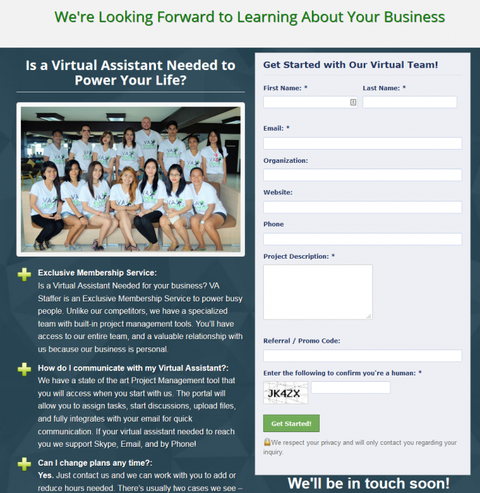
On the right is option B, it contains:
- Header Text
- Photo
- Text
- Some Bulleted Text (Checkboxes)
- The Form
- Privacy Statement
Now You’ll notice the key Differences:
- Landing Page A has a Menu
- Landing Page A does NOT have a Photo
- Landing Page A has a Logo (I don’t seem to have enough evidence to say this effects conversion rate much)
- Landing Page B does NOT have a Menu
- Landing Page B has a Photo.
- Landing Page B does NOT have a logo (I don’t think this really matters much as stated above.
One of these pages has a landing page conversion rate increase of 42%
Queue Drumroll
Which is it? Answer: Option B
The one that got more conversion that got more conversions has NO menu, they have nowhere to go – and a Photo. Personalized photo, not stock photos, you, or your team. People like people – people are relationship creatures; they like relationships.
Option B works.

The landing page conversion rate is just higher. From 2-4 people a day to about 3-6 people converting on the form a day. This is proven, it just works, don’t give them an exit on your form, and personalize it.
Take a look at how the form looked before, and take a look at the one we’re using now:
If you’re using OptimizePress take a look at some of these landing pages as examples for you to get higher conversions. If you want to take a stab at it, make sure not to copy our content, do your own copy so no one’s penalized by Google, but feel free to copy the design elements. Also if you find a Virtual Assistant Needed to perform this for you – contact us.
I want you to have a higher landing page conversion rate, I want you to have more sales, I want you to have better results. Thanks for watching Whiteboard Wednesday Episode 3: Landing Page Conversion Rate and join me at Conversion Marketing if you need help.
Thank you, and stay tuned for more Whiteboard Wednesday
TAKE BACK YOUR TIME!
Our team can save you a ton of time and energy that can be better spent elsewhere.
You know that already, that’s why you’re here!


