Graphic design importance exploring website design trends with new-age marketing automation.
This blog showcases Modern Website Design 2015 has to offer with some examples that have changed drastically in the last few years. The introduction of HTML5, Javascript, and powerful content management systems (CMS) have opened up a world of options. WordPress alone has empowered even the most amateur person being able to pull of a modern website design without breaking the bank. If you are an artistic joke like myself, you can use a graphic design assistant on our team.
MODERN WEBSITE DESIGN 2015 EXAMPLES
In this article, I’ll show some examples we use in-house along with some of the great websites out there for you to pull some great modern website design inspiration. You’ll also see the science behind the design, and user experience – hang tight, take notes, and get ready to learn!
Modern Landing / Header
Visualy Stimulating & Engaging
Modern Website Design Tips
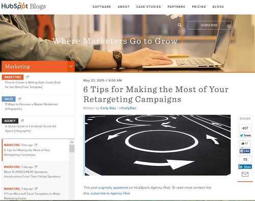
1) Hubspot Blog
Check out the large full width header image, clean crisp menu – and oh there’s that transparent button we talked about earlier. In addition, Hubspot blog really has a big drop-down “mega menu” with a ton of information to absorb. Using the mega-menu give you the opportunity to put a good amount of pages without cluttering up your top menu bar by giving a clean and organized drop down. You’ll also notice the blog posts have a nice big header image on the top of each of them – that’s best practice for practically every website now-a-days.
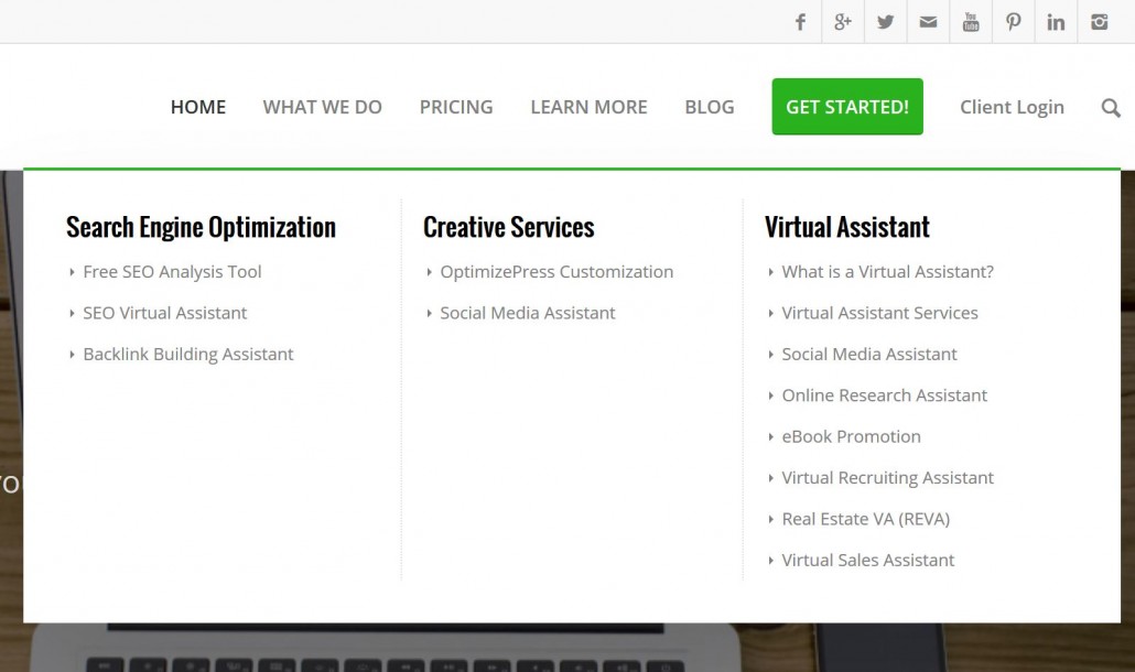
1.5) Mega Menus
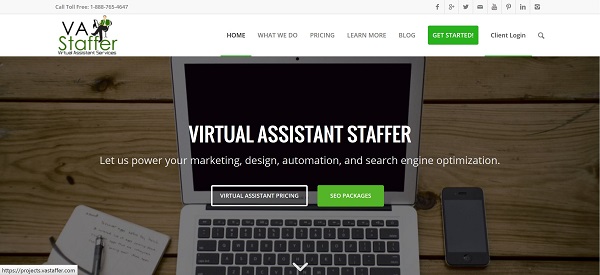
Adding to the design above from Hubspot, check out the Mega Menu on our own site. I wanted to show an example of how you can provide plenty of information to learn about your business without taking up a lot of real estate on the menu. Of course, it’s very important to factor in the way the menu looks in a responsive / mobile format. You’ll want to keep the Hierarchy clean and easy to understand so people can easily access content they’re looking for.
MODERN WEBSITE DESIGN FOR SUCCESSFUL MARKETING
Something EVERY business should have if they’re using Inbound Marketing Methodology is Lead Magnets / Landing Pages. You want to provide real VALUE to your visitors, and earning their trust. It’s part of our Four M’s of Inbound Marketing that gain valuable information from your potential customers by delivering targeted content to your target audience.
Landing Pages / Lead Magnets offer some great incentives / offers / information in exchange for their contact information – hence, lead generation. Creating quality leads for your business is critical, if you’re offering something for free that they would pay for typically, you’re going to get their information. Focus on offering free downloads that relate to a product or service you offer. Let them do it themselves and realize why they need you – use the download to show the value you have to offer.
Check out these amazing examples of Landing Pages / Call-to-Actions big websites use. If you don’t have the artistic ability (like me) you can utilize our graphic design assistant team, so don’t worry.
AIRBNB Call to Action Example:
Here is an example of a dark background and an upbeat color for the call-to-action on Airbnb previous design. Notice that Airbnb is using a busy image in the background but they have replaced the CTA to a light semi-transparent box and inputted it on the middle of their page to ensure that the CTA will be recognized as soon as someone visited their site.
STRIPE Call to Action Example:
Stripe has achieved the same sense of space and focus by placing its CTA against a dark background. Almost the same on their previous page, except now they are highlighting actual screen captures of their software in action. They’ve also added a secondary call to action for documentation -a great idea for current and future customers.
Everyone knows how critical a website is to any business’s online marketing strategy, but what does it really take to have a fine tuned website that gains visitors, drives leads and increases revenue?
This free, 42-page Call-To-Action research we did on 19 different major websites is the ultimate resource to fine tuning your own website from big dollar businesses who’ve changed with the times from countless dollars of testing and research on their own sites.
You will learn:
- How time has transformed the messaging on 19 big-player websites in online-marketing.
- Important design and user experience factors you need to act on.
- Tips for displaying content that attracts and entices your users to convert.
- Some best practices from top companies for converting traffic into prospective leads, including Call-to-Action, Landing Pages (Lead Magnets), and Forms
TAKE BACK YOUR TIME!
Our team can save you a ton of time and energy that can be better spent elsewhere.
You know that already, that’s why you’re here!


